Vextro®
2025 · Visual identity · Digital marketing
An agency that chose to sell its clients instead of itself.
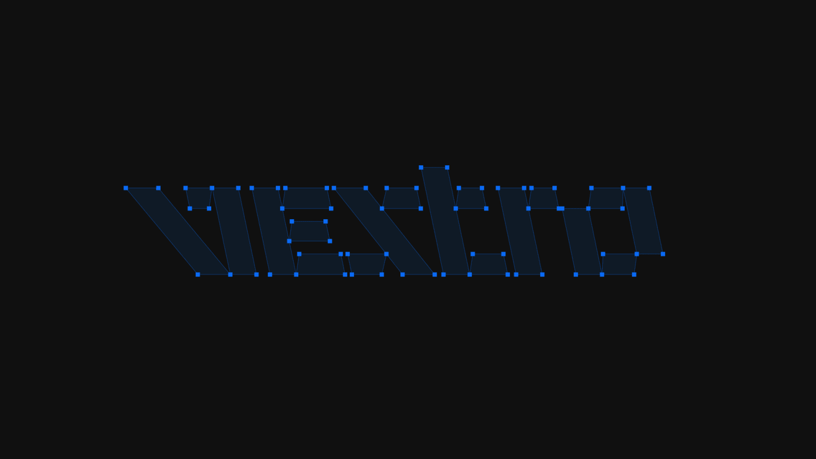
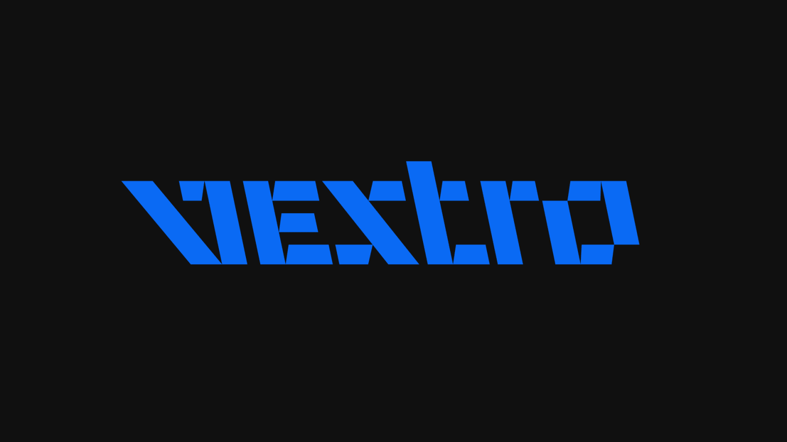
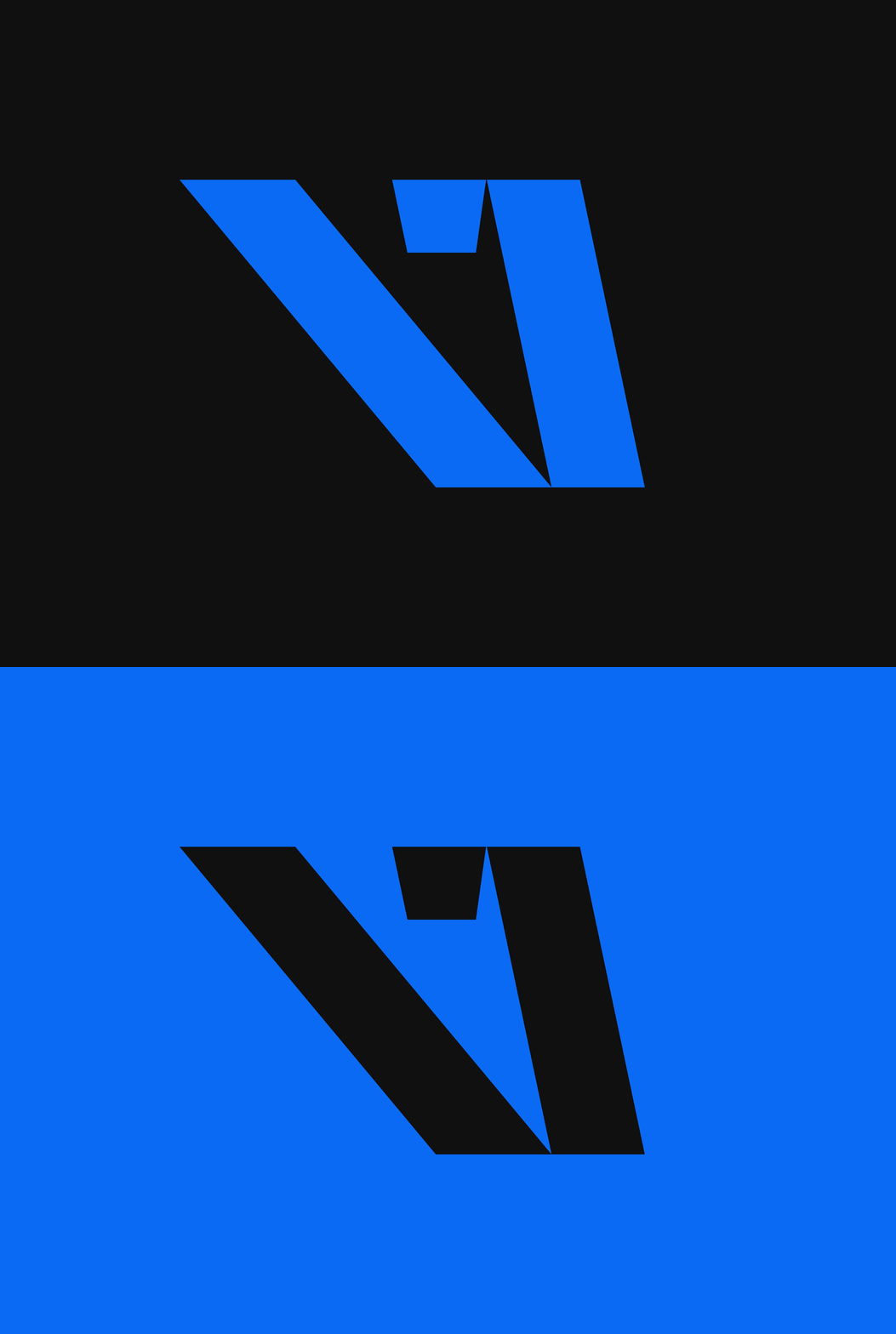
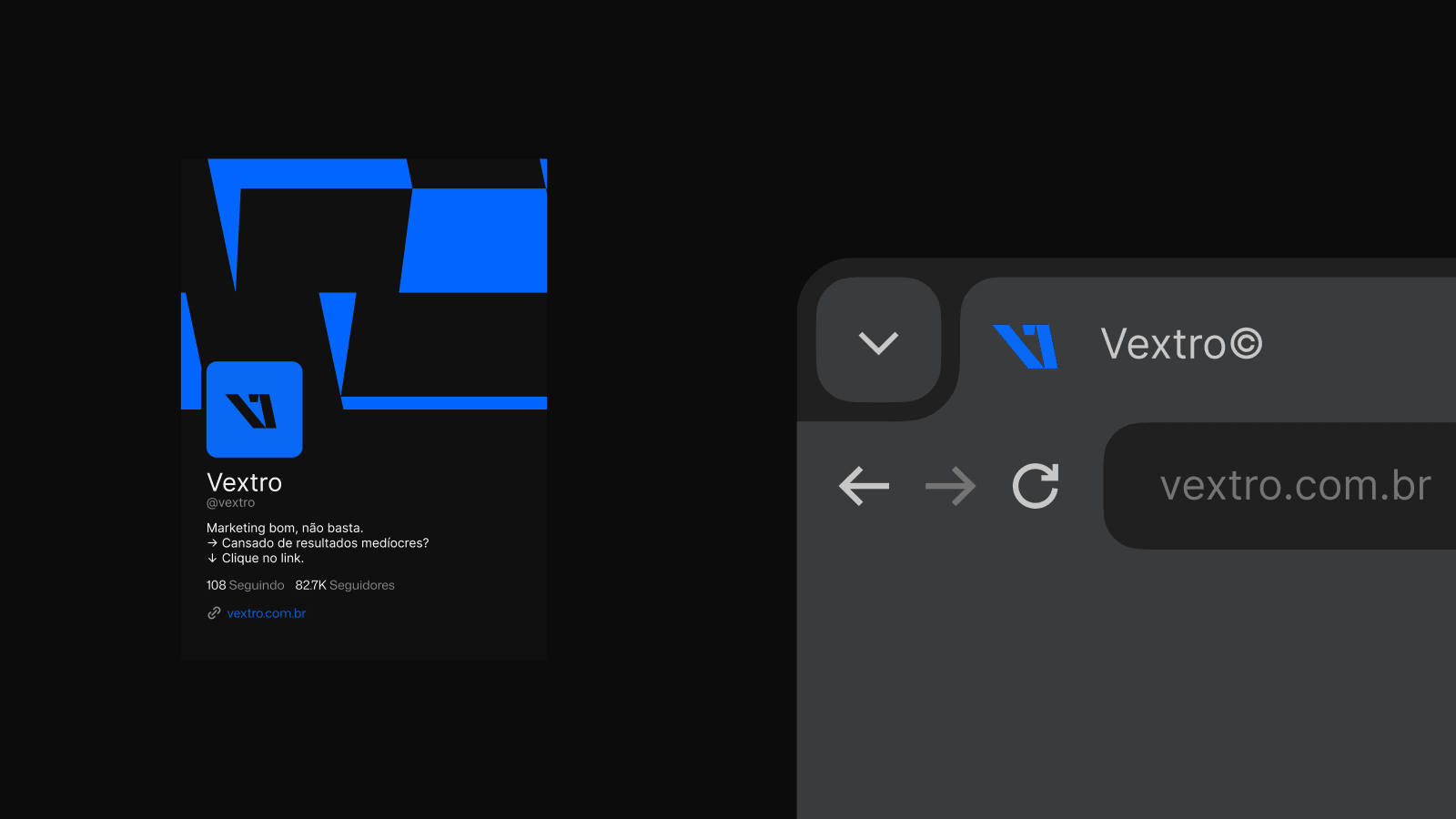
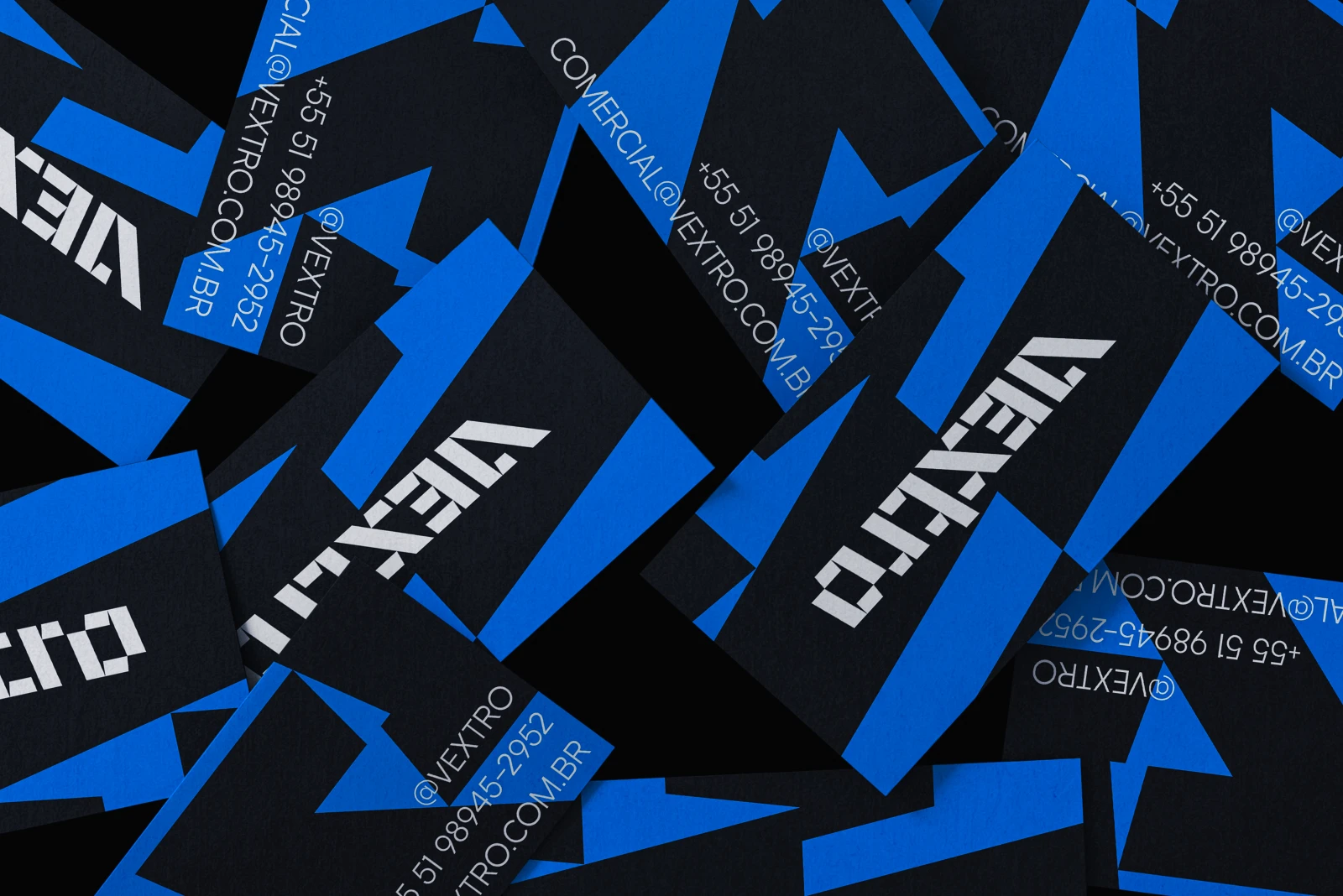
Open vextro.exe in the systemVextro was born from dissatisfaction. The marketing industry sells itself; Vextro chose to sell its clients. The logo is modular and deconstructed, with the italic inverted: it goes against the current deliberately.
The problem
The marketing industry learned to sell itself: pretty reports, vanity metrics, a portfolio standing in for the client result.
The solution
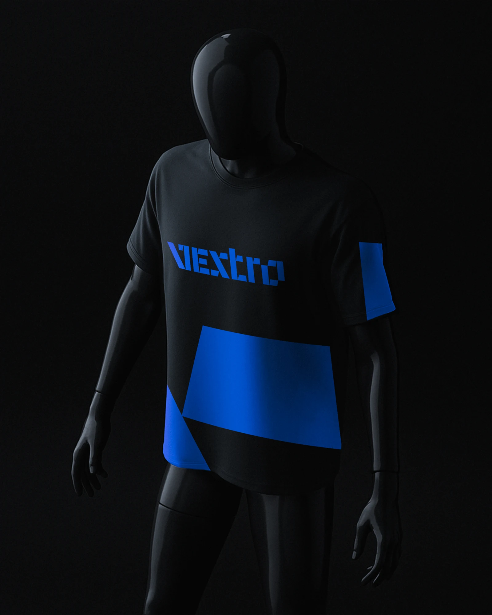
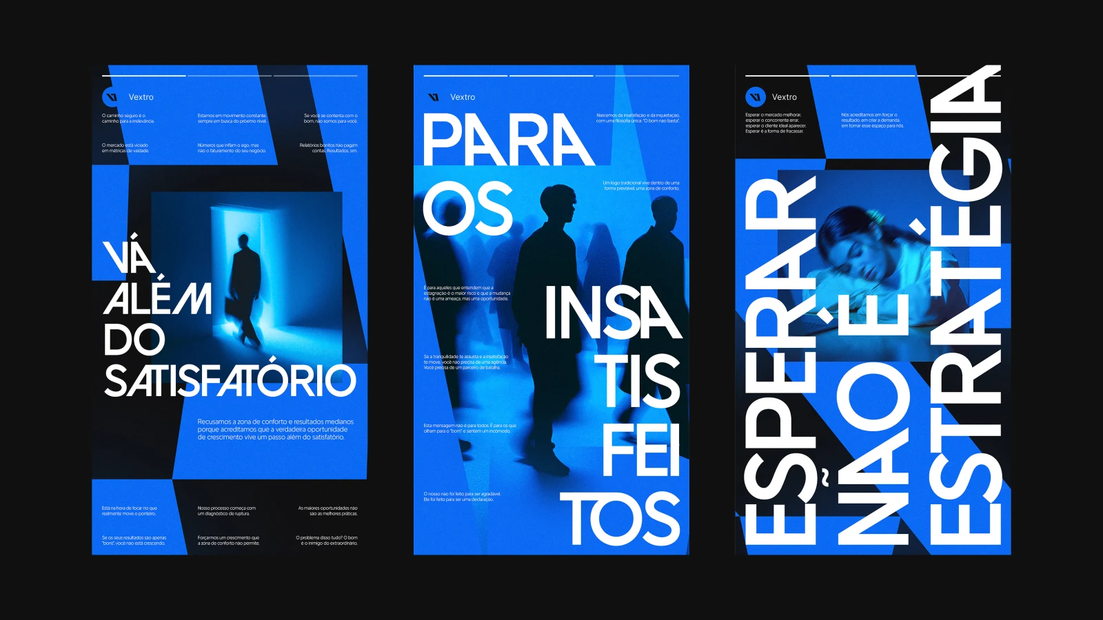
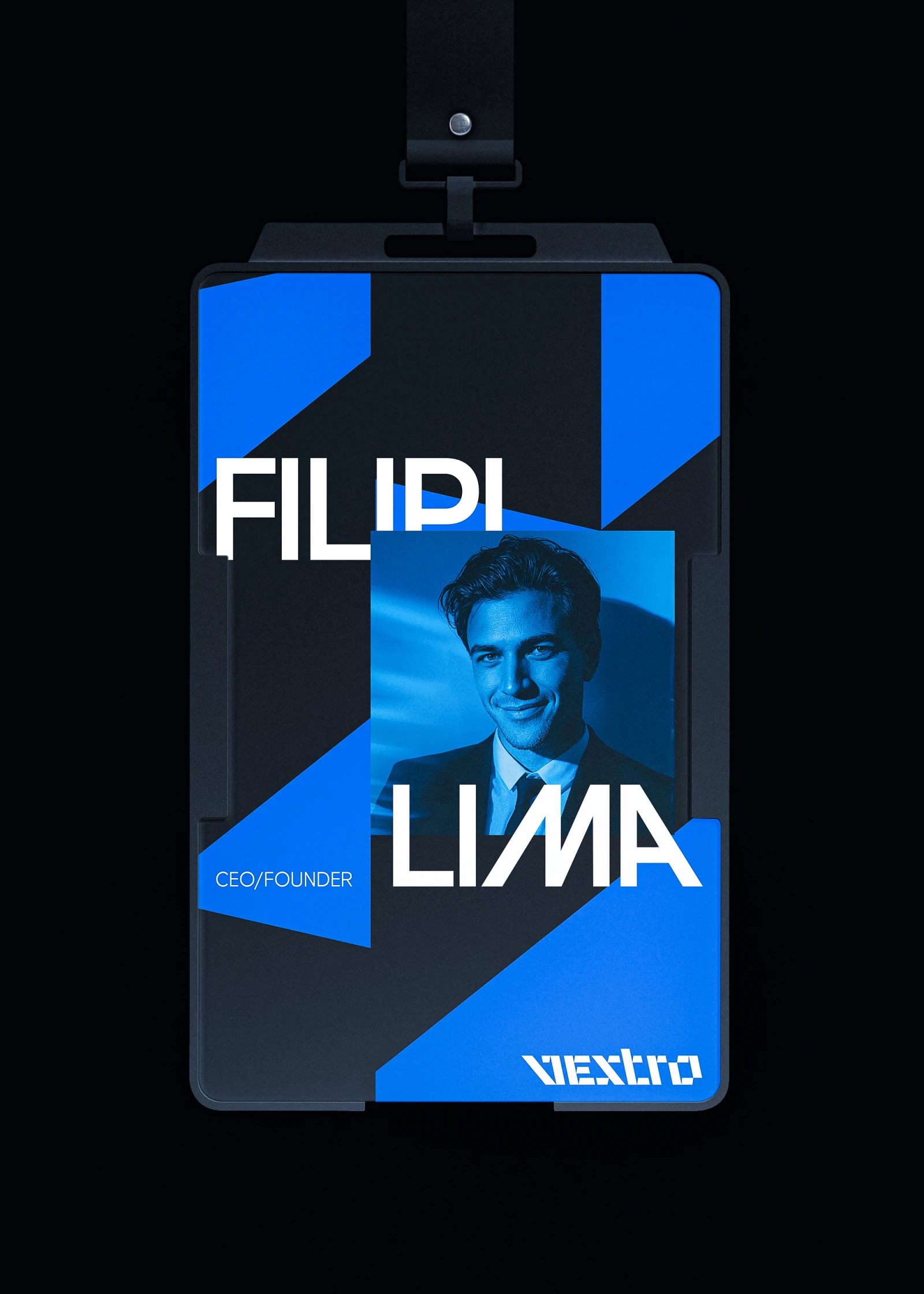
Blue as the color of rivalry, a direct stance against the major players. Black adds weight. The typography combines stable characters with disruptive alternatives, and the graphic elements come from the logo itself, fragments of the letters. The photography follows the same logic: dark environments, blue lighting, intentional motion blur. Every decision has a reason; none of them are aesthetic.
Gallery

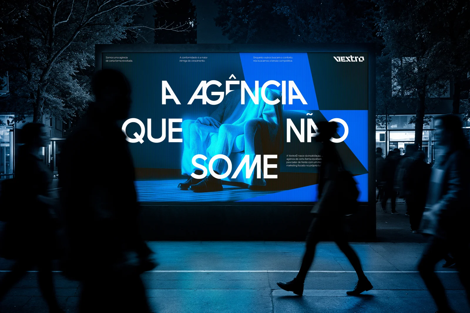
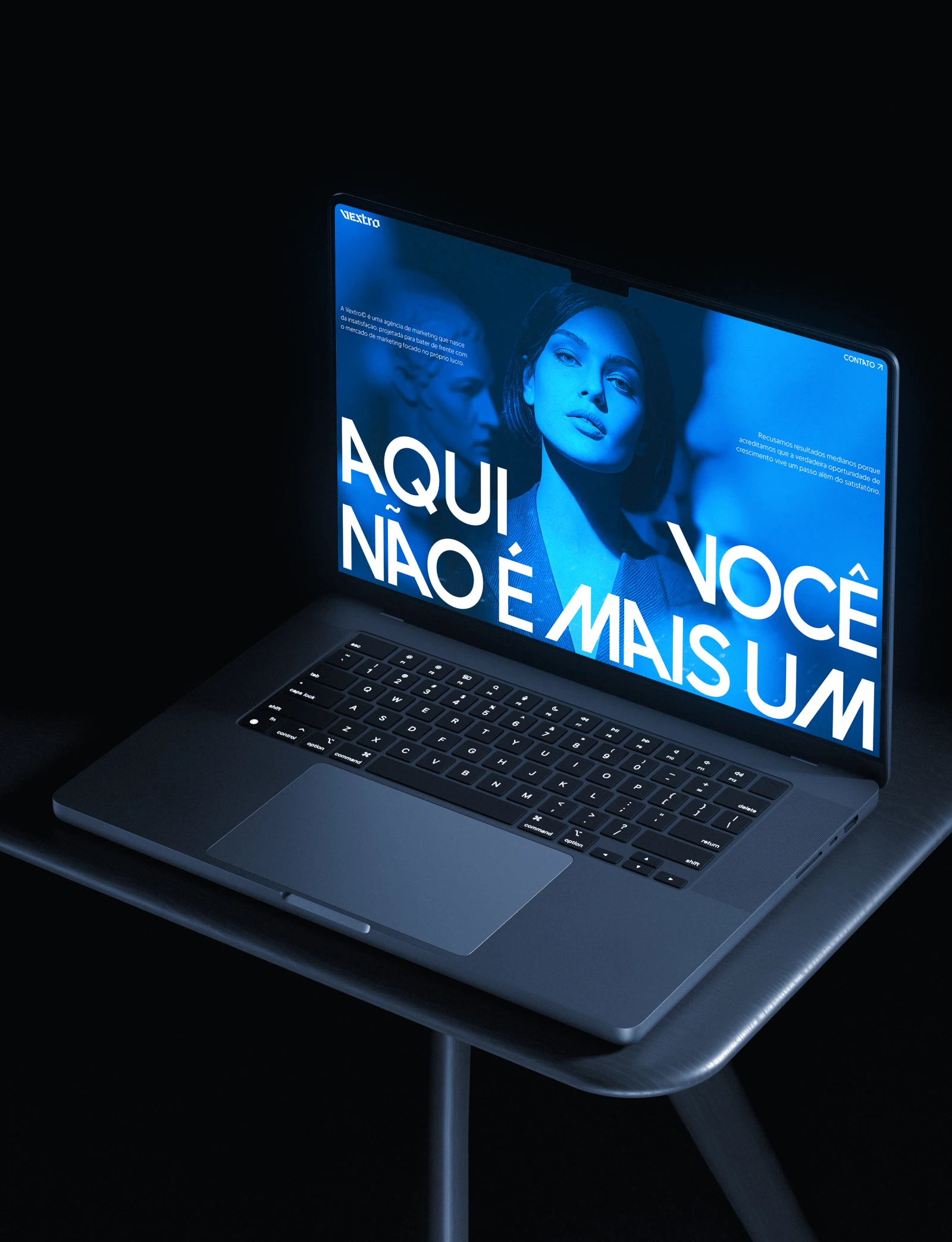
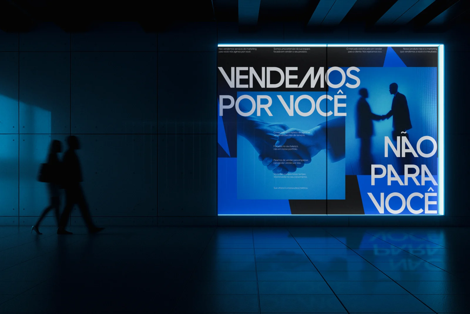
Specs
- Year
- 2025
- Category
- Visual identity · Digital marketing
- Contribution
- Brand strategy · Creative direction
- Stack
- Brand strategy · Visual identity · Art direction · Marketing
- Status
- Published
- Art direction
- Jeferson Gonçalves
- Strategy
- Jeferson Gonçalves
- Design
- Jeferson Gonçalves
- Typography refinement
- Jean Rosa
- Typeface
- Avantique, by Casloop Studio
- Typeface
- Plus Jakarta, by Tokotype
- Published
- 2025-04-28 · Alvorada, Brazil
Other cases
- Build+Partners® (2026, Visual identity · Architecture): An architecture firm that also trains the next generation of architects and engineers.
- Movitera® (2026, Visual identity · SaaS): The identity of a technical suite that puts tickets, secrets and assets in one place.
- C0FFE® (2026, Visual identity · E-sports): A coffee brand for the people who watch Twitch at 3am with a mug next to them.
- Clube® (2026, Visual identity · Sports influence): A brand that puts creators first and treats influence as a journey.
- Korri® (2023, Visual identity · Sportswear): Team-style clothing for the daily grind, without looking like you are heading to the stadium.
Contact
I take on brand identity, art direction and brand tool projects, working remotely with clients anywhere. Write to jeferson@051jeferson.zip, or on WhatsApp.